Ep. 10 | That Elusive “Nordic Design”: The Art of Subtraction in Helsinki
Defining Nordic Design
Somewhere along the way, “Nordic design” transformed into an everyday buzzword. I was never someone with an obsessive interest in interior decorating, yet even without going out of my way to research it, the distinct aesthetic of Scandinavian design naturally made its way into my consciousness.
Because the term has become so ubiquitous, everyone defines it a little differently. Some equate Nordic design strictly with minimalism; others picture clean, monochromatic black-and-white interiors. While definitions abound, I like to think of Nordic design as “a design that is concise and uncluttered, yet never hollow—and fundamentally open and usable for everyone.”
While Scandinavian design gained massive mainstream popularity in South Korea during the late 2000s, its history stretches back nearly a century. What fascinates me most is that everyday objects created during the birth of the movement a hundred years ago still look remarkably modern today. They have survived a full century without feeling outdated or fatigued.
By stripping away excess and staying relentlessly loyal to functional essence, these objects ensure effortless utility for anyone who uses them. It isn’t merely simplicity achieved by deleting visual elements; it carries a restrained elegance that withstands the passage of time. In many ways, that quiet durability has always been something I deeply admire.
Marimekko: Wildflowers in the Snow
When people think of Finnish design houses, Marimekko is often the first name that comes to mind. If you view Nordic design purely as black-and-white minimalism, Marimekko might seem like an outlier. In reality, it reflects the very core of Nordic design principles while embracing vivid boldness.
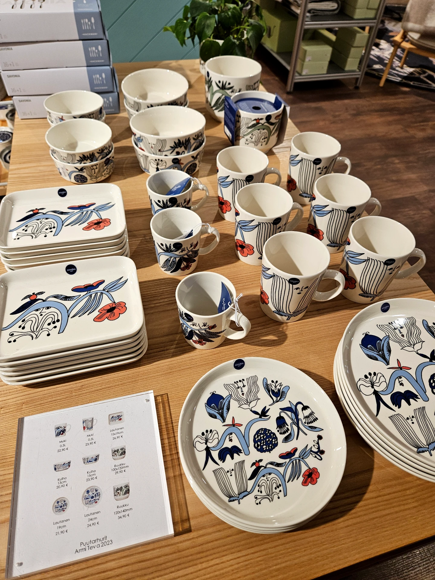
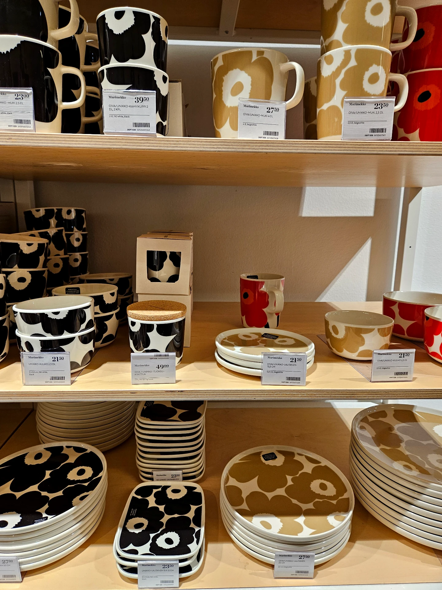
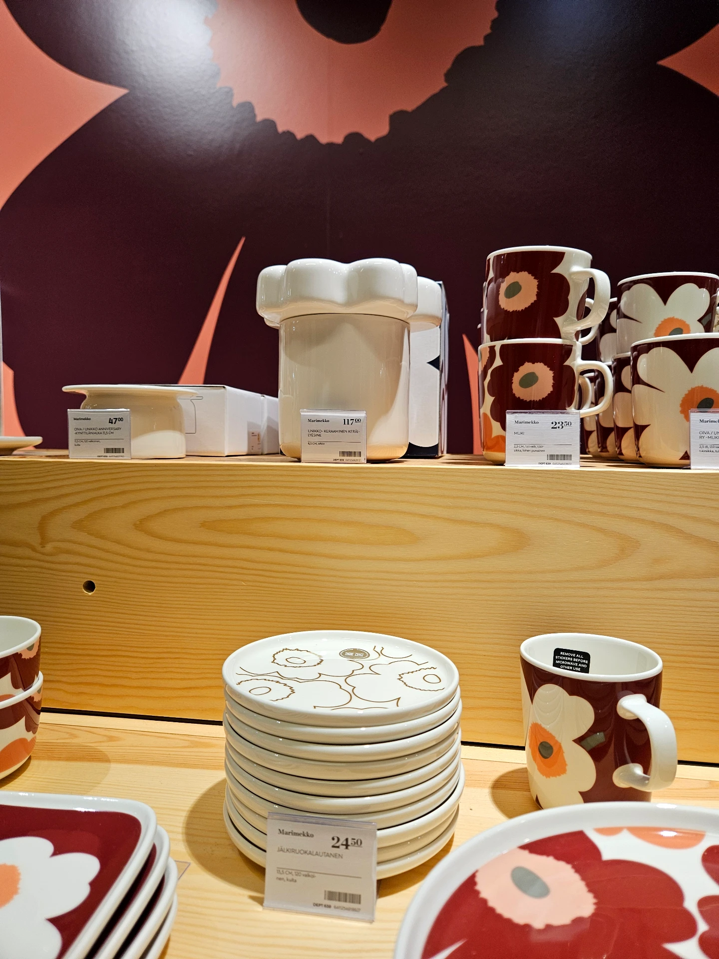
Within the Scandinavian design heritage, Marimekko champions graphic expression and color. Personally, I have always appreciated their stylized floral patterns and deliberate palettes. While the colors are bold, they are subtly muted and tone-matched to create harmony. What could easily turn visually monotonous is instead brought to life by their bold, graphic prints—all while the underlying silhouettes remain strictly functional and simple.
Marimekko stores are impossible to miss across Helsinki. Walking through their boutique inside Stockmann Department Store, with tableware arranged in crisp, orderly lines, the vibrant prints felt like seeing resilient wildflowers pushing up through the Arctic snow. In fact, once the frost thaws, bright wildflowers bloom naturally across the entire Finnish landscape.
Moomin: Eighty Years of Line and Form
Moomin is another unmistakable symbol of Finland, holding a cherished place in the nation’s cultural identity.
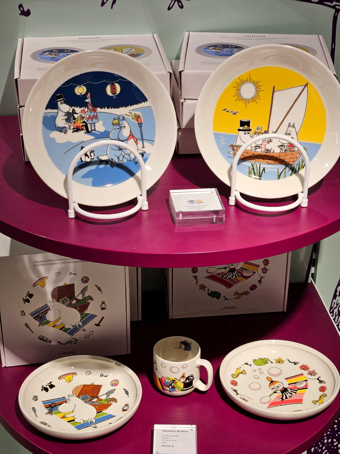
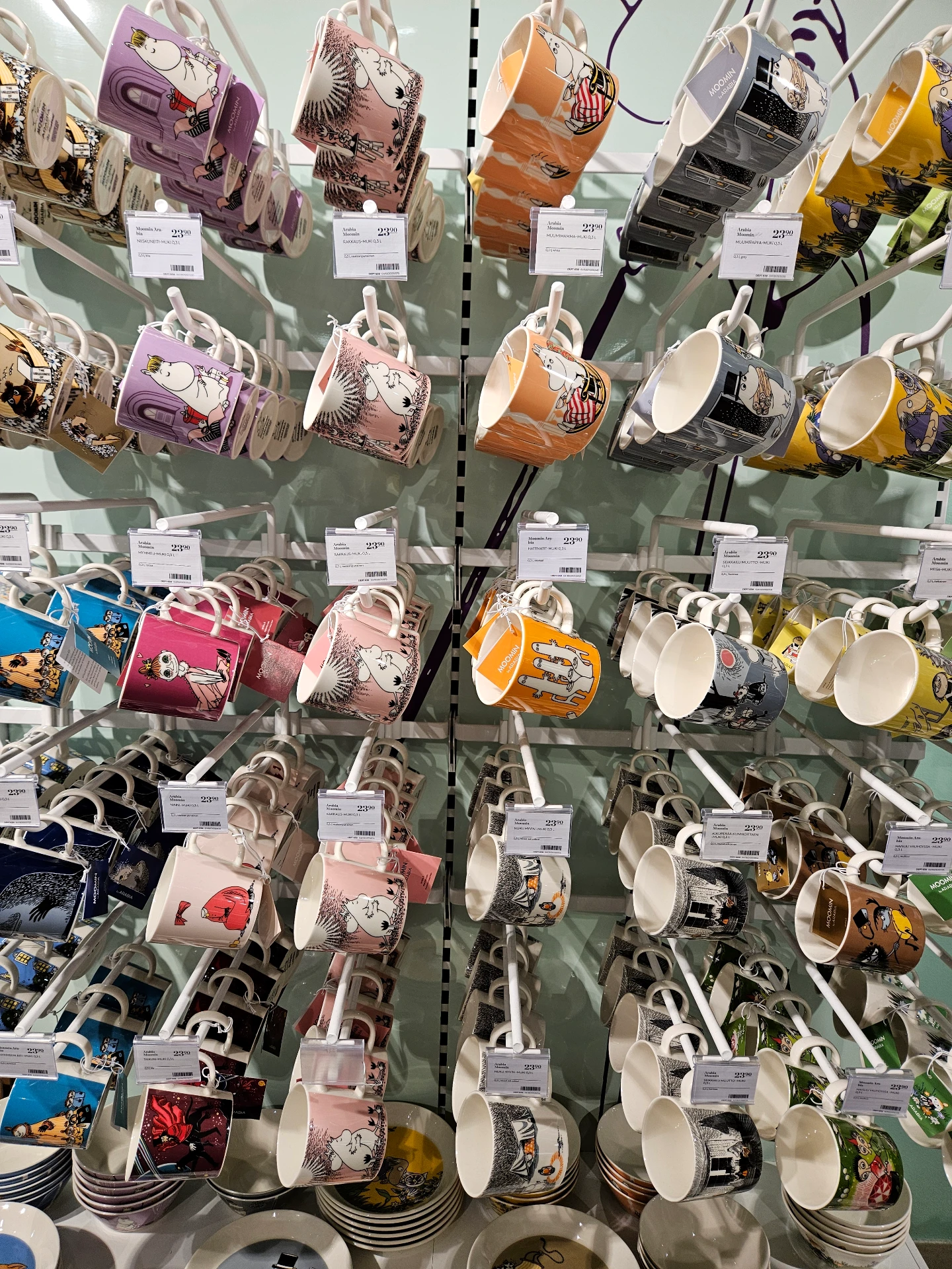
Created in the 1940s, the character is now over eighty years old. While subtle stylistic tweaks have occurred over the decades, Moomin has retained its core silhouette while being embraced across generations—mirroring the longevity of Nordic design itself.
Drawn with simple black outlines on a pure white body, Moomin is visually clean at its core. But seeing how Finnish designers integrate this classic illustration into textiles, porcelain, and everyday home goods gives you an even deeper appreciation for how seamlessly design merges into daily Finnish life.
A Century of Enduring Refinement
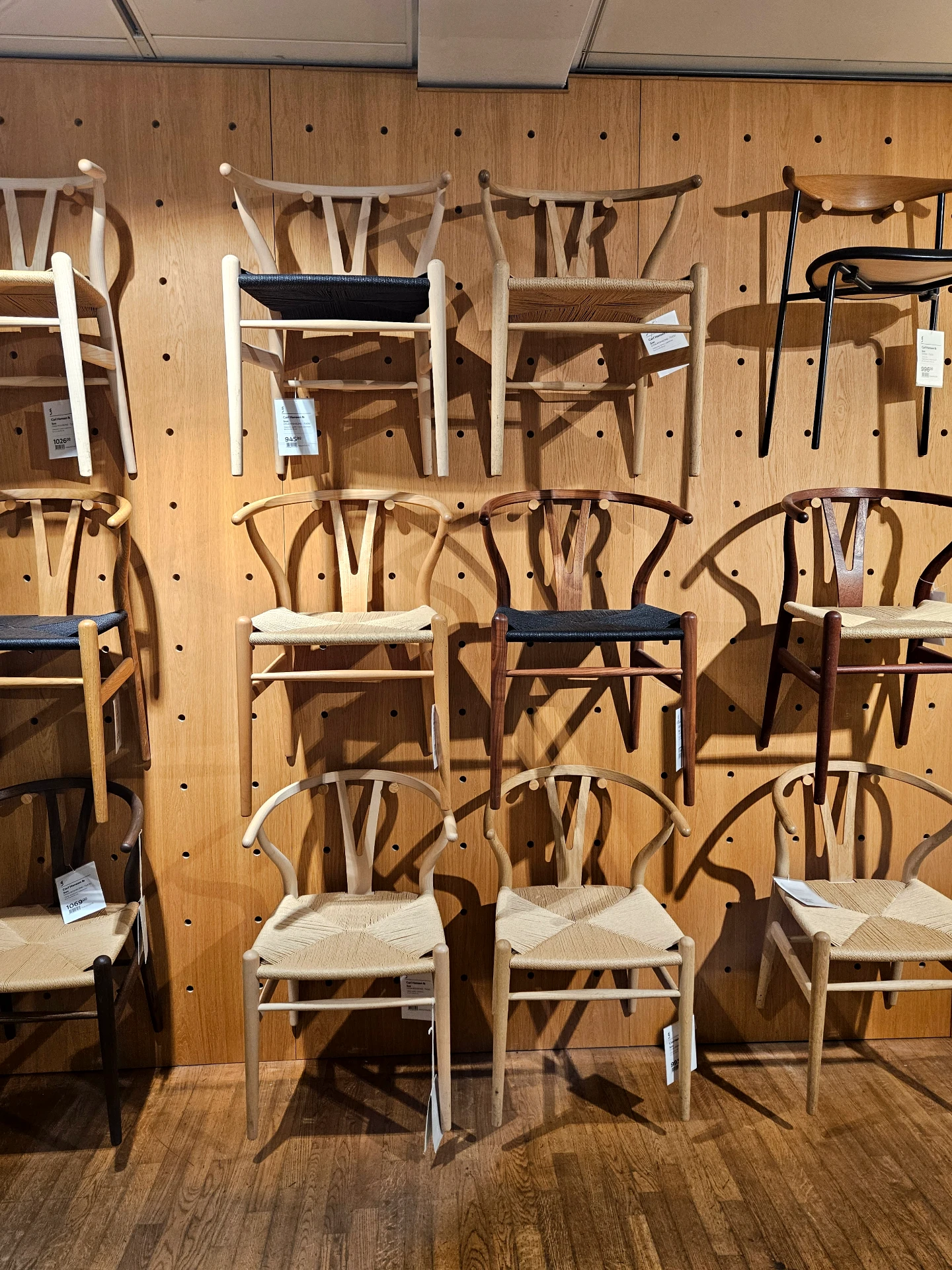
Step into any Finnish furniture showroom, and you are surrounded by the distinct aura of Nordic craftsmanship. Behind almost every modern piece sits an iconic mid-century original. When you compare those century-old blueprints with the furniture on display today, the divergence is remarkably subtle. Creating such forward-thinking designs a century ago was brilliant, but the way modern Nordic designers preserve that philosophy while making incremental, practical refinements is equally impressive.
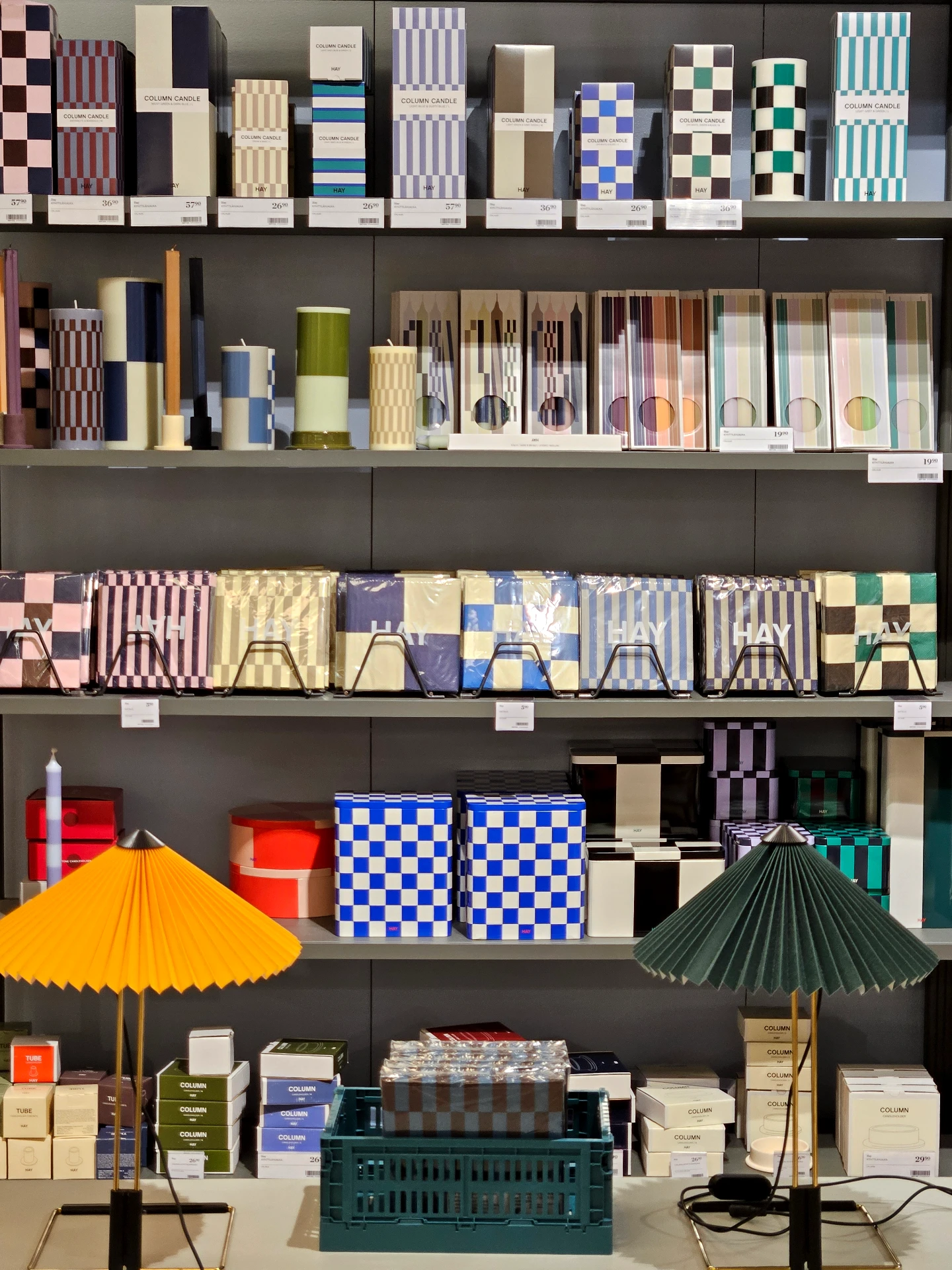
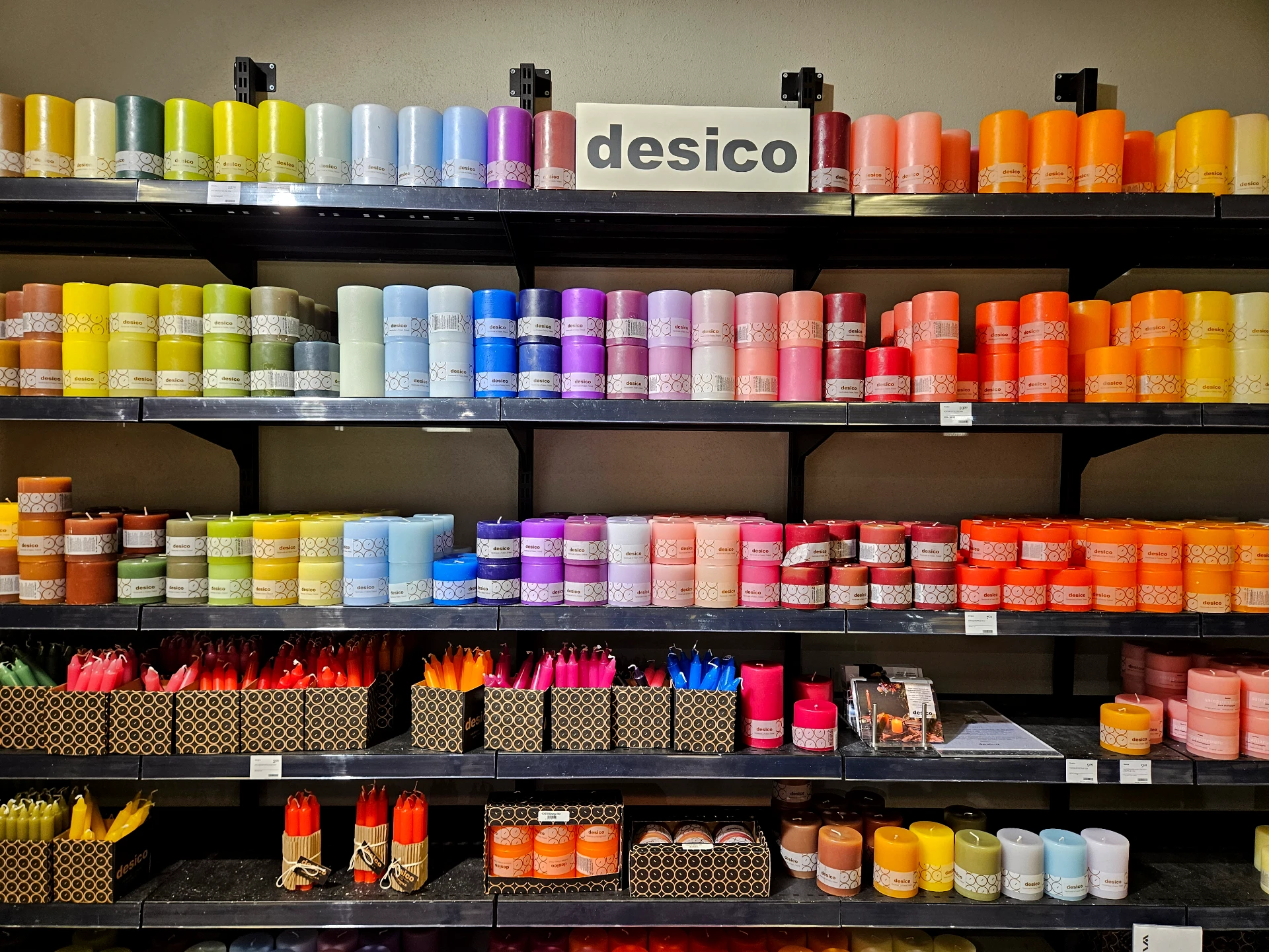
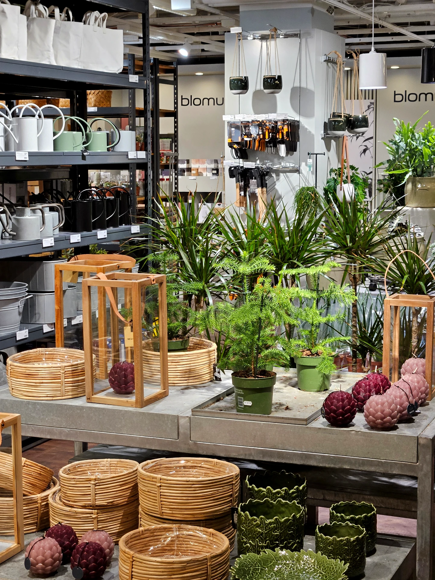
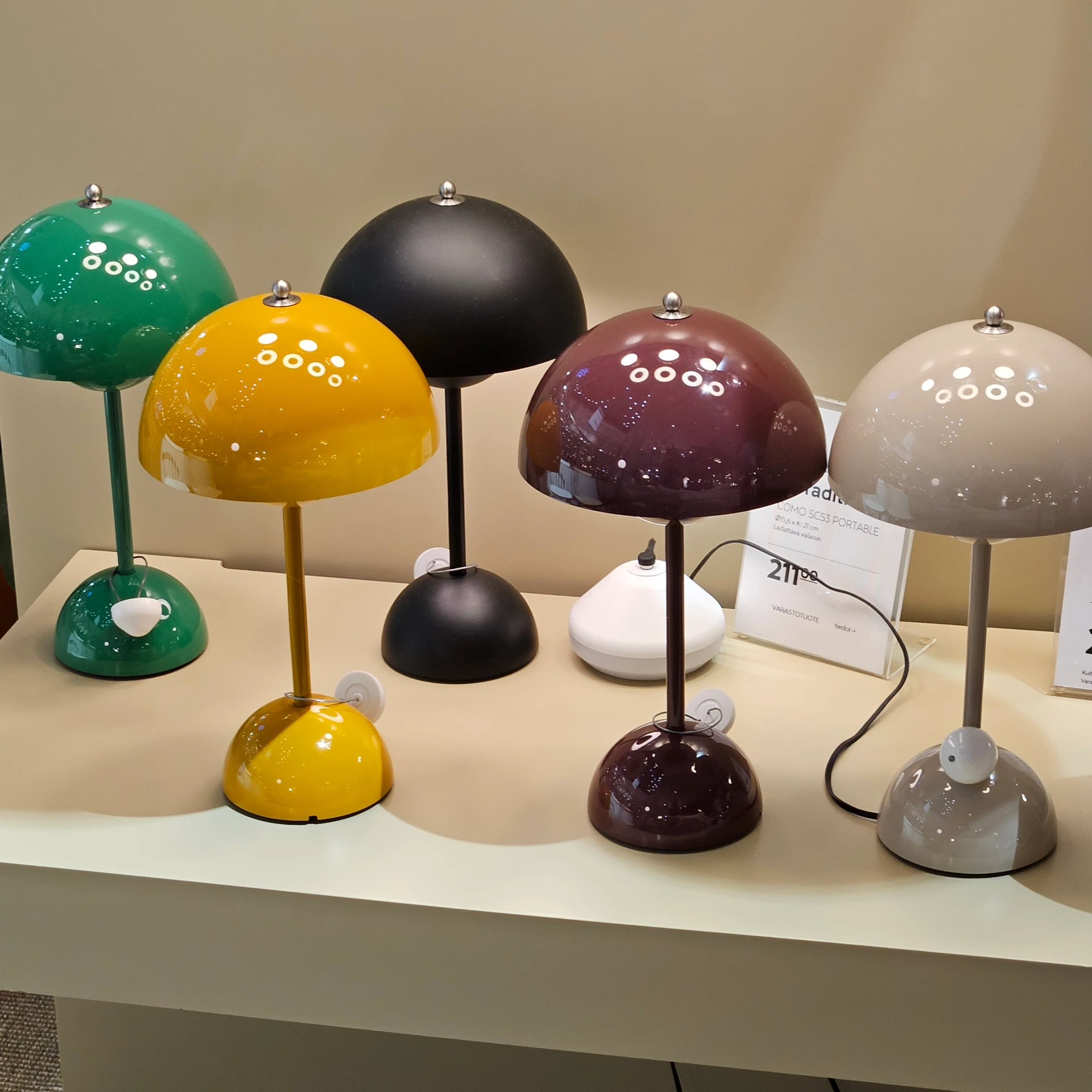
Browsing local interior boutiques, you also encounter an unexpected wealth of rich, expressive colors. Associating Nordic design exclusively with stark black-and-white palettes is much like assuming Finland is made entirely of snow. In reality, Finnish design treats that white expanse as a blank canvas, adding curated, purposeful accents of color to complete the composition. Just as it would be unfair to reduce Finland to its winter frost, confining Nordic design to a monochrome template ignores the rich evolution cultivated by its creators.
The Art of Subtraction
“That elusive Nordic design”—it’s a phrase I find myself repeating often. While the term has become a universal shorthand, fully grasping the lifestyle and collective wisdom behind it is far more nuanced.
Living in the United States, where culture often leans toward maximalism and scale, the quiet restraint of Nordic design feels even more refreshing. I have always believed that subtracting is significantly harder than adding. A design philosophy that has spent generations mastering the delicate art of subtraction offers a timeless reminder to a modern world often overwhelmed by excess.